

artwing.Get a quote

A brand is a short list of decisions. Most decks avoid making them.

Three moodboards and a question about which one feels right is not brand strategy. It is a way of making you responsible for a decision we were hired to make. We close the decisions first, in writing, and design from them.

We work on brand identity and strategy, for startups building from nothing and for established companies evolving: identity, naming, positioning and rebrands.

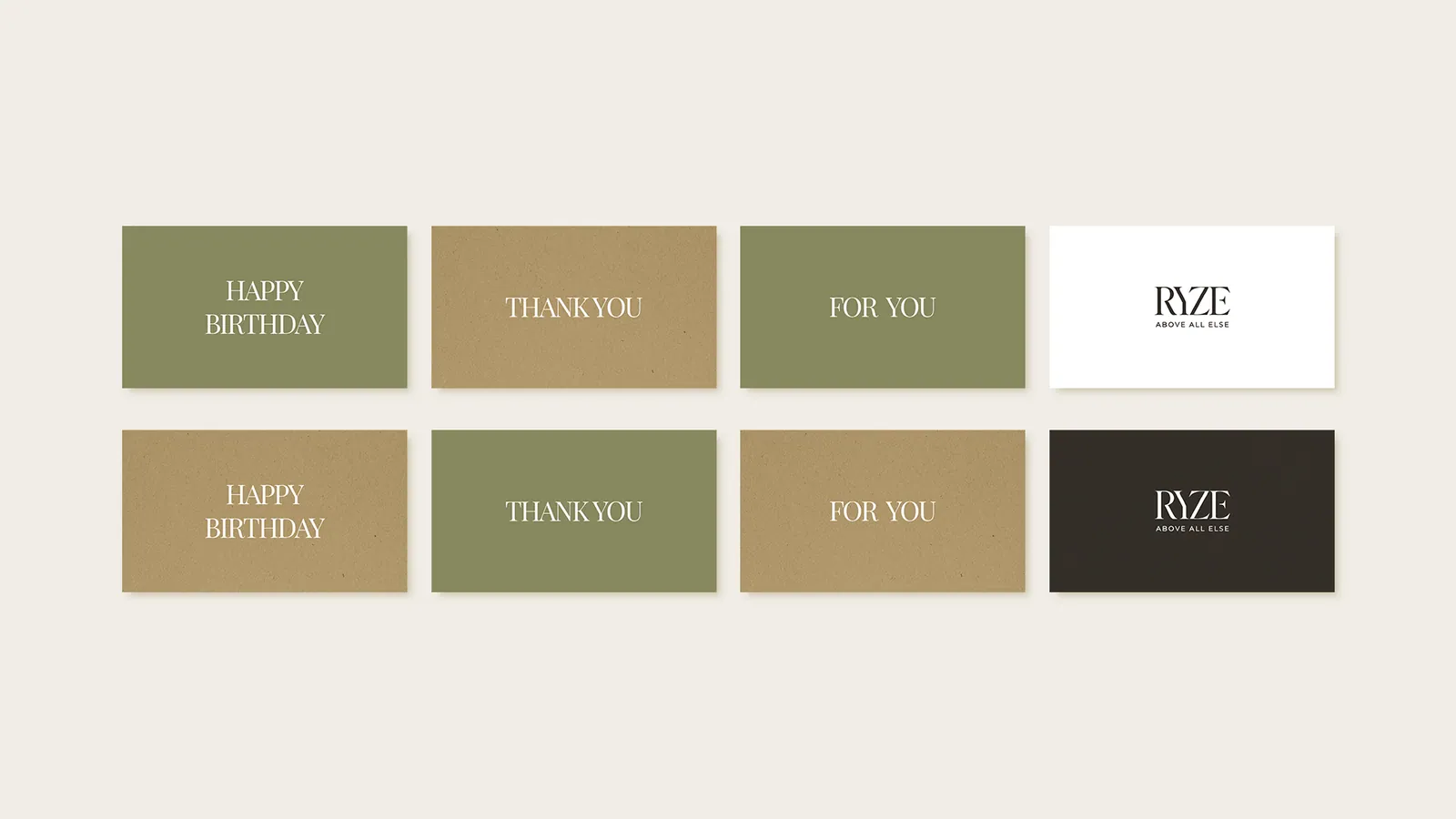
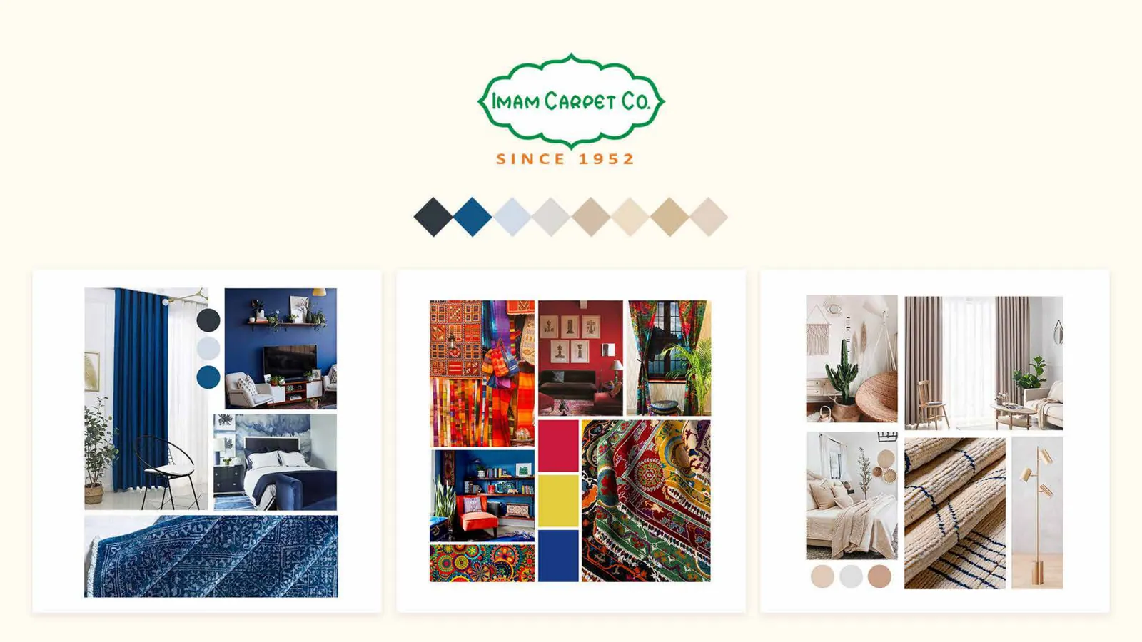
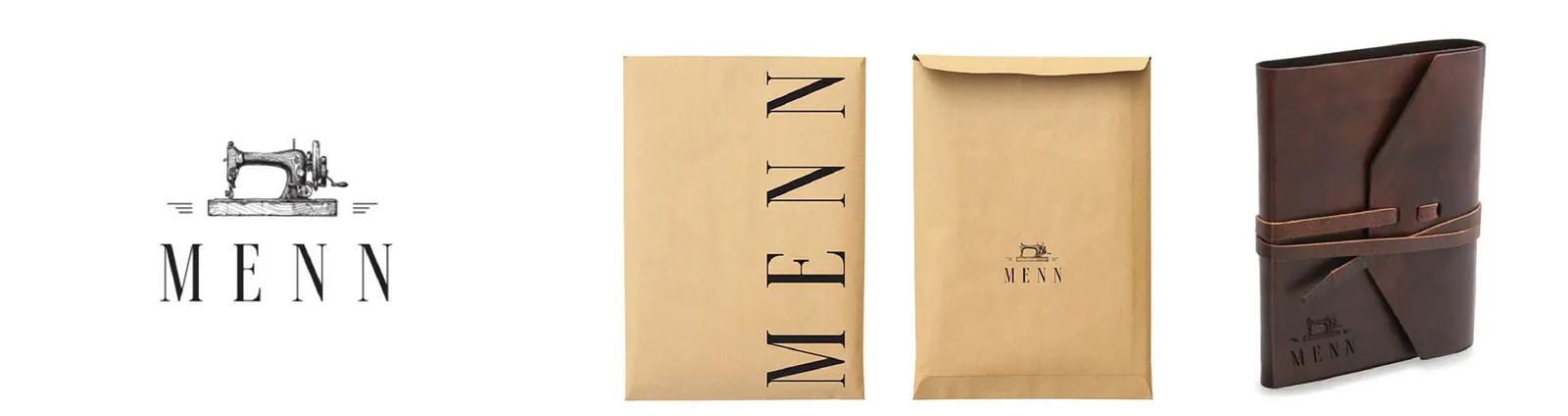
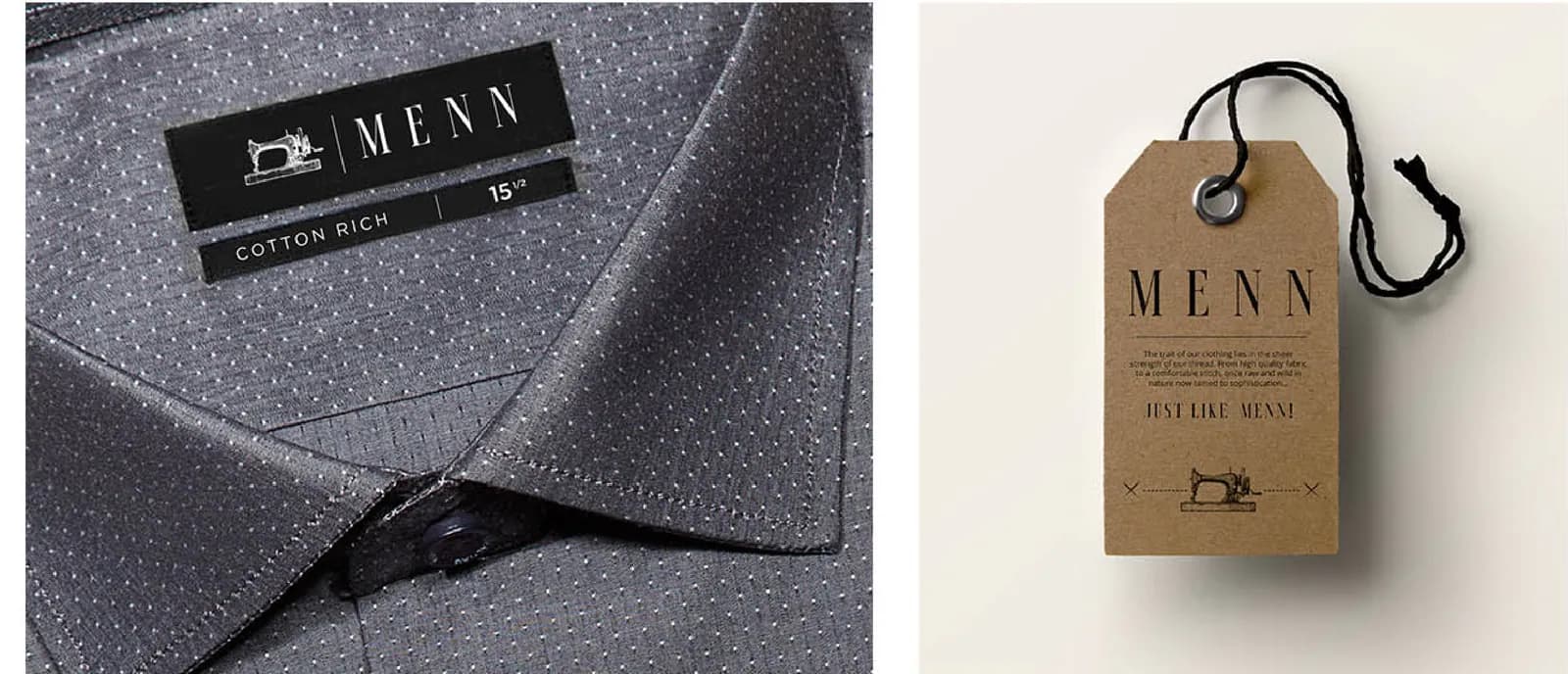
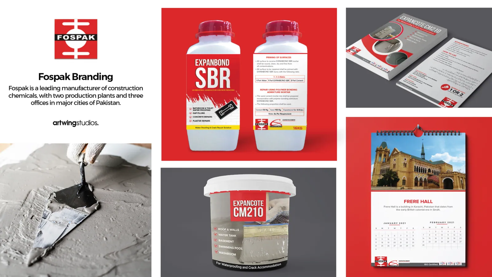
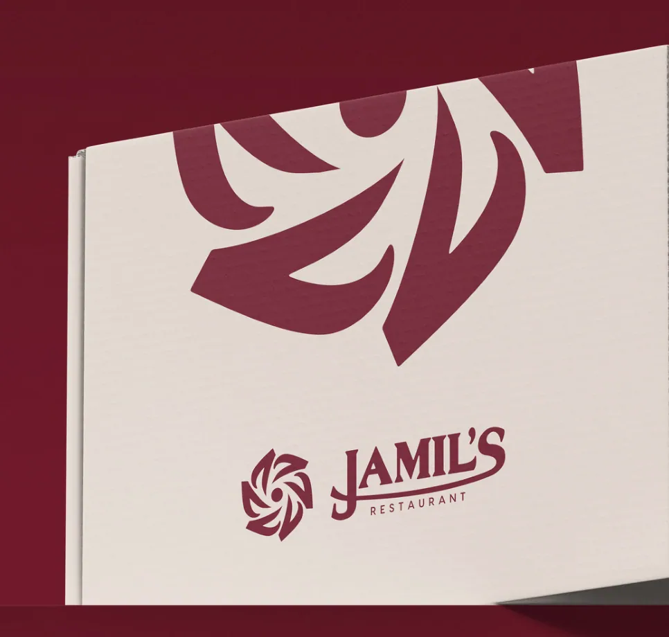
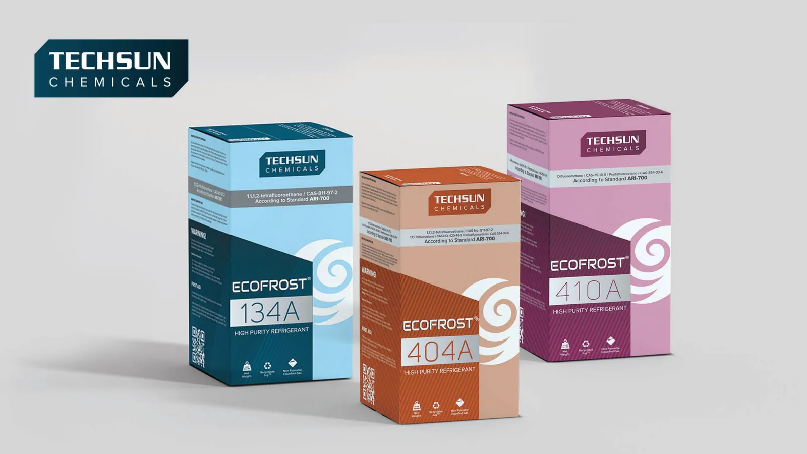
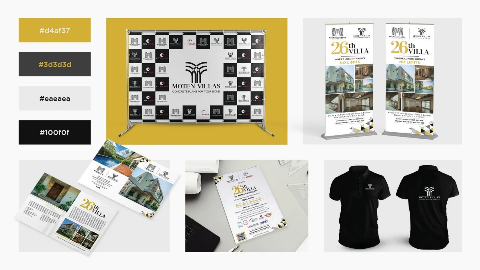
Brand guides, logos and packaging we have made

Each piece as we handed it over, with the client's name under it. Where the brand has a story here, a live site or an Instagram, the name opens it.

Brand guides

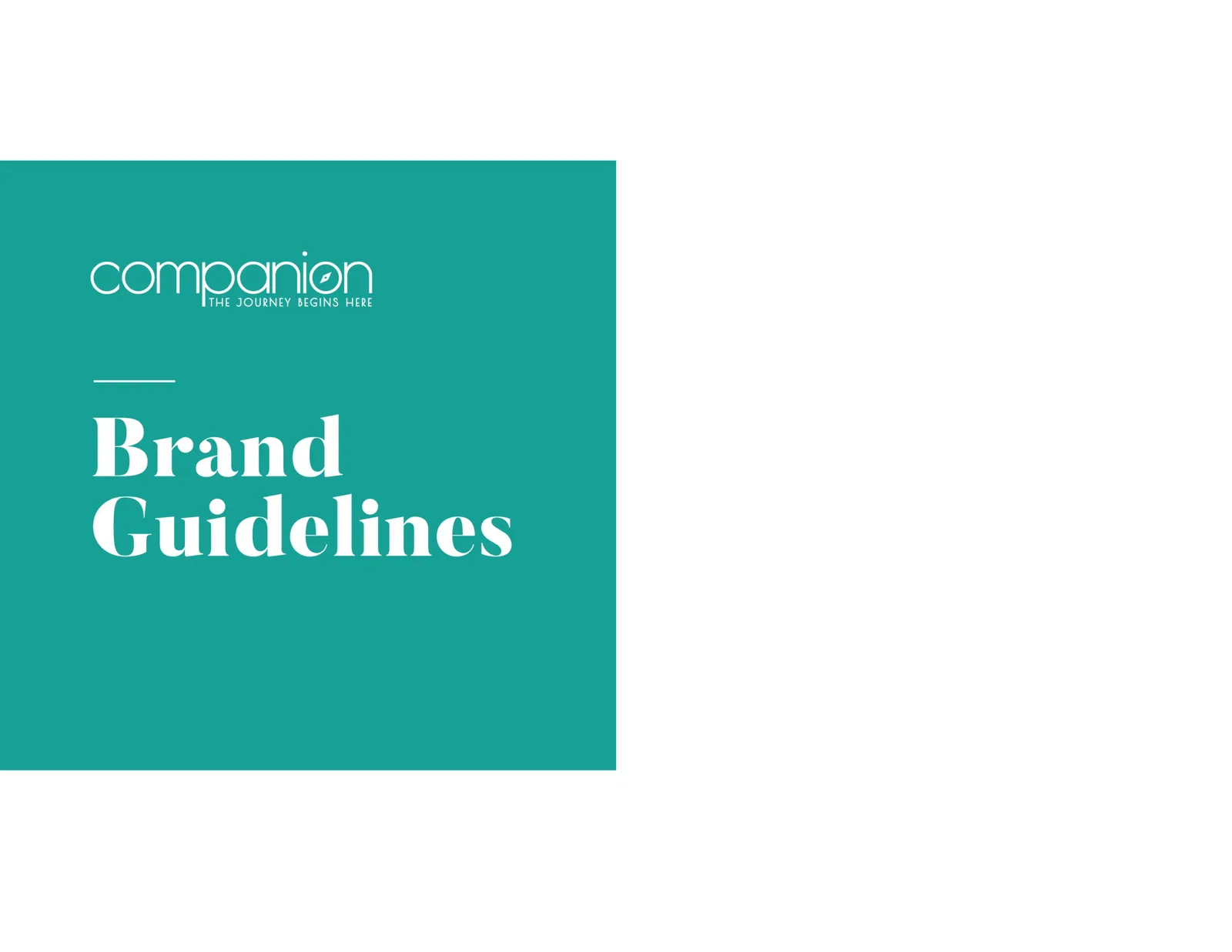
  • Companion brand guidelines cover: the companion wordmark and the words Brand Guidelines on teal
    CompanionBrand guidelines: the cover
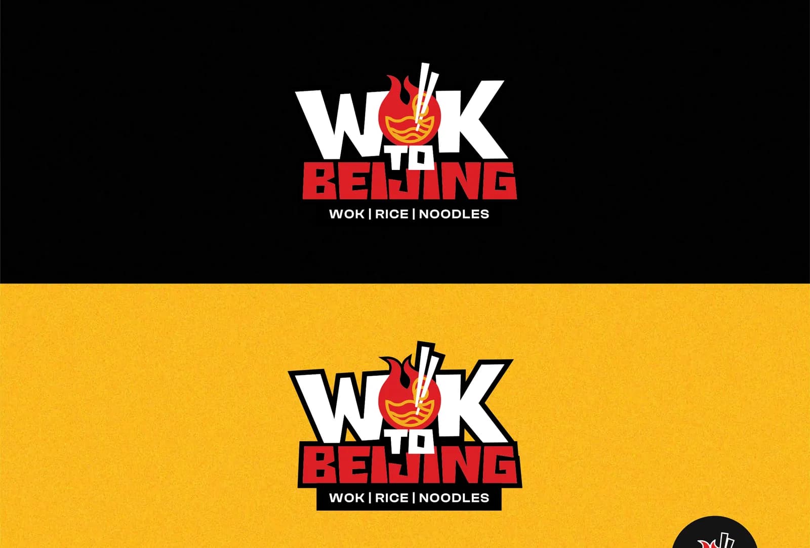
  • The Wok to Beijing logo, a flaming bowl with chopsticks above Wok, Rice, Noodles, on a black band and on a yellow band
    Wok to BeijingBrand guide: the logo on black and on yellow, July 2026
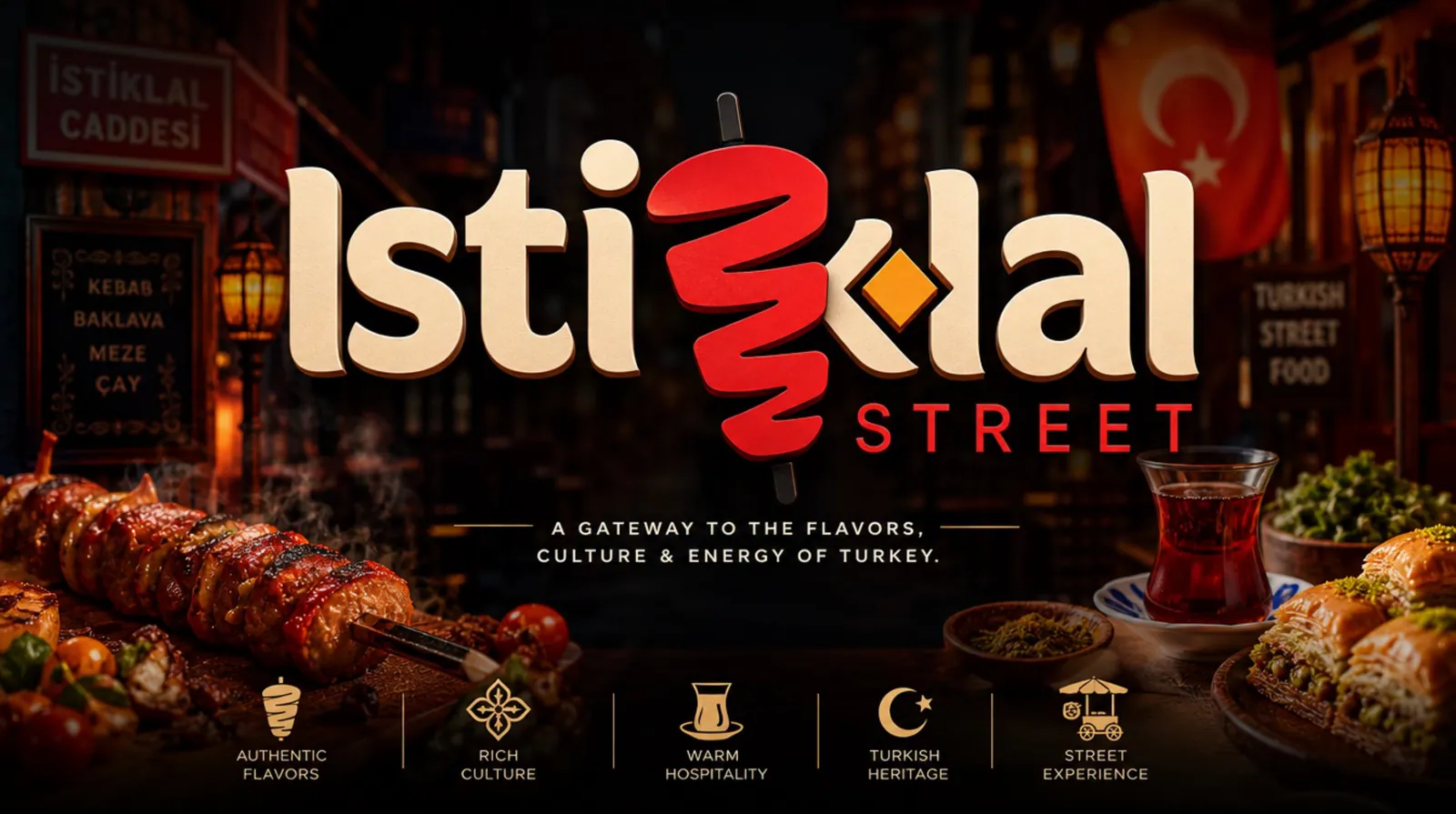
  • Istiklal Street brand guideline cover: the red and white logo, a gateway to the flavours, culture and energy of Turkey, over a dark street-food scene
    Istiklal StreetBrand guideline: the cover, June 2026
  • PCI Interiors brand style guide: the cover over a wooden floor, then the green logo and its P-C-I icon
    PCI Interiors (opens in a new tab)Brand style guide: the cover and the logo
  • The indigo rent a car wordmark in white on deep purple
    Indigo Rent A CarBrand guide: the logo
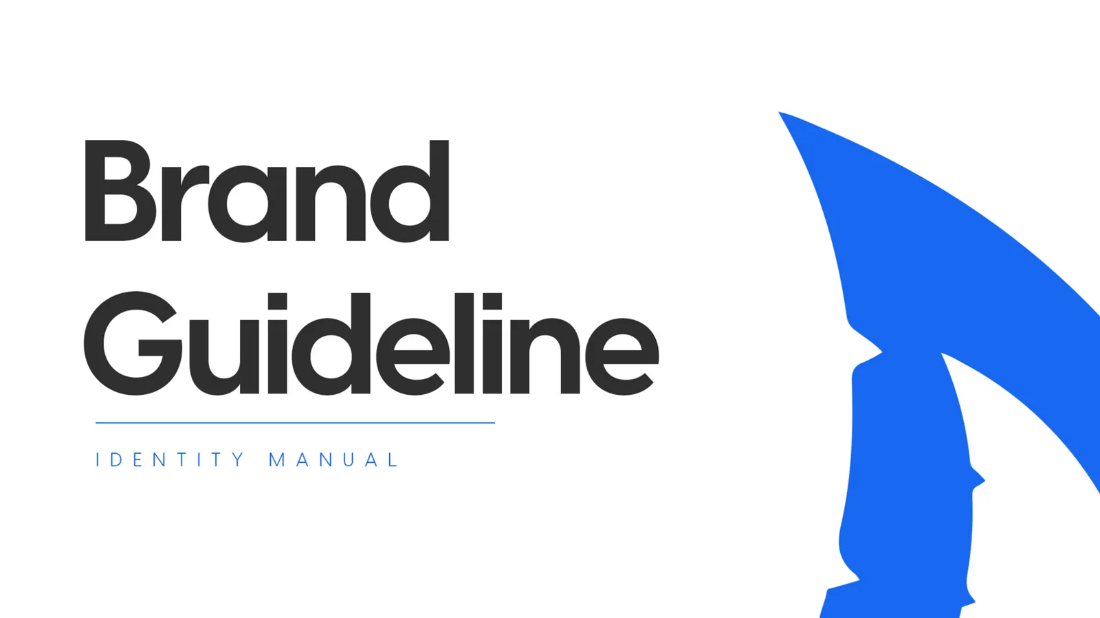
  • PhoneShark brand guideline cover: the words Brand Guideline beside a large blue shark-fin mark
    PhoneSharkBrand guideline: the cover
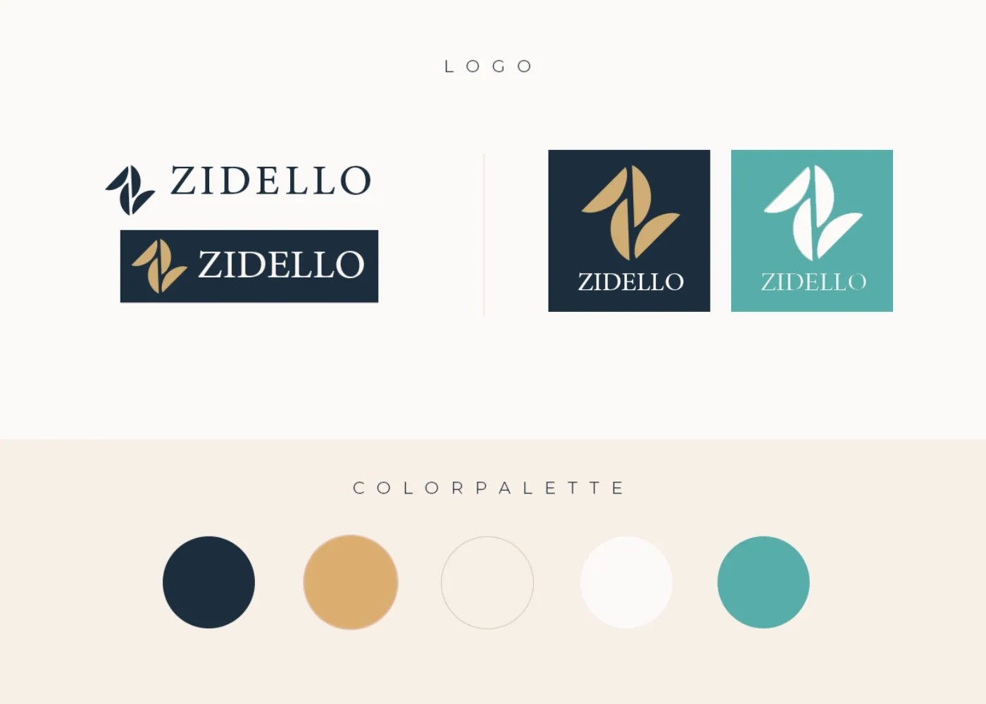
  • Zidello's logo in navy, gold and teal versions, above a row of five colour swatches
    Zidello (opens in a new tab)Brand guide: the logo and the colours

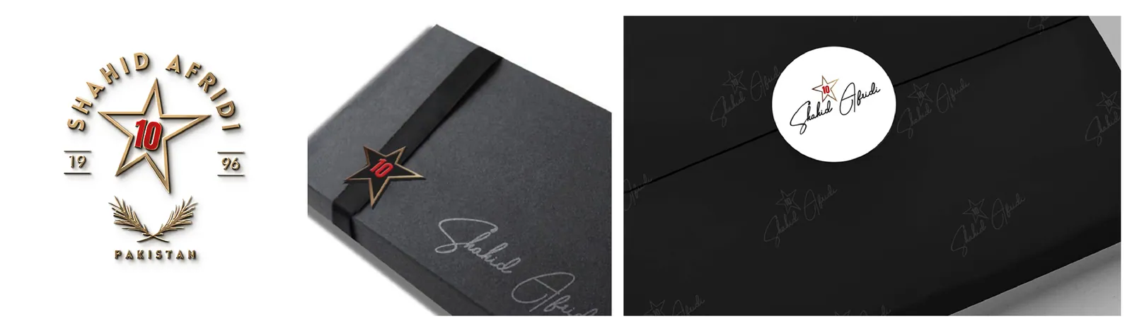
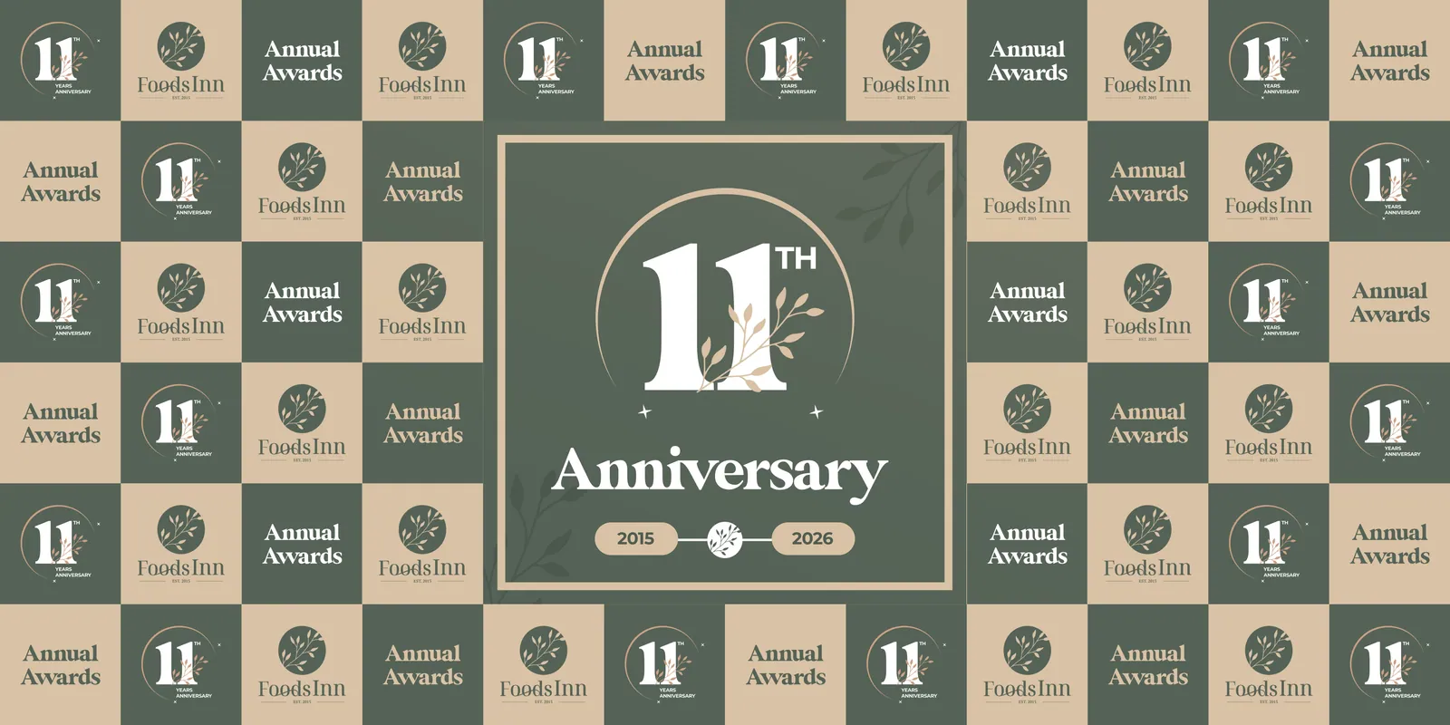
Logos, stationery and menus

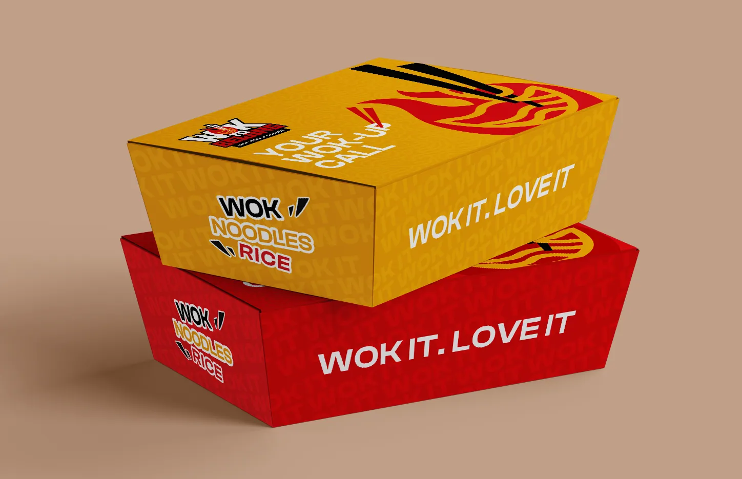
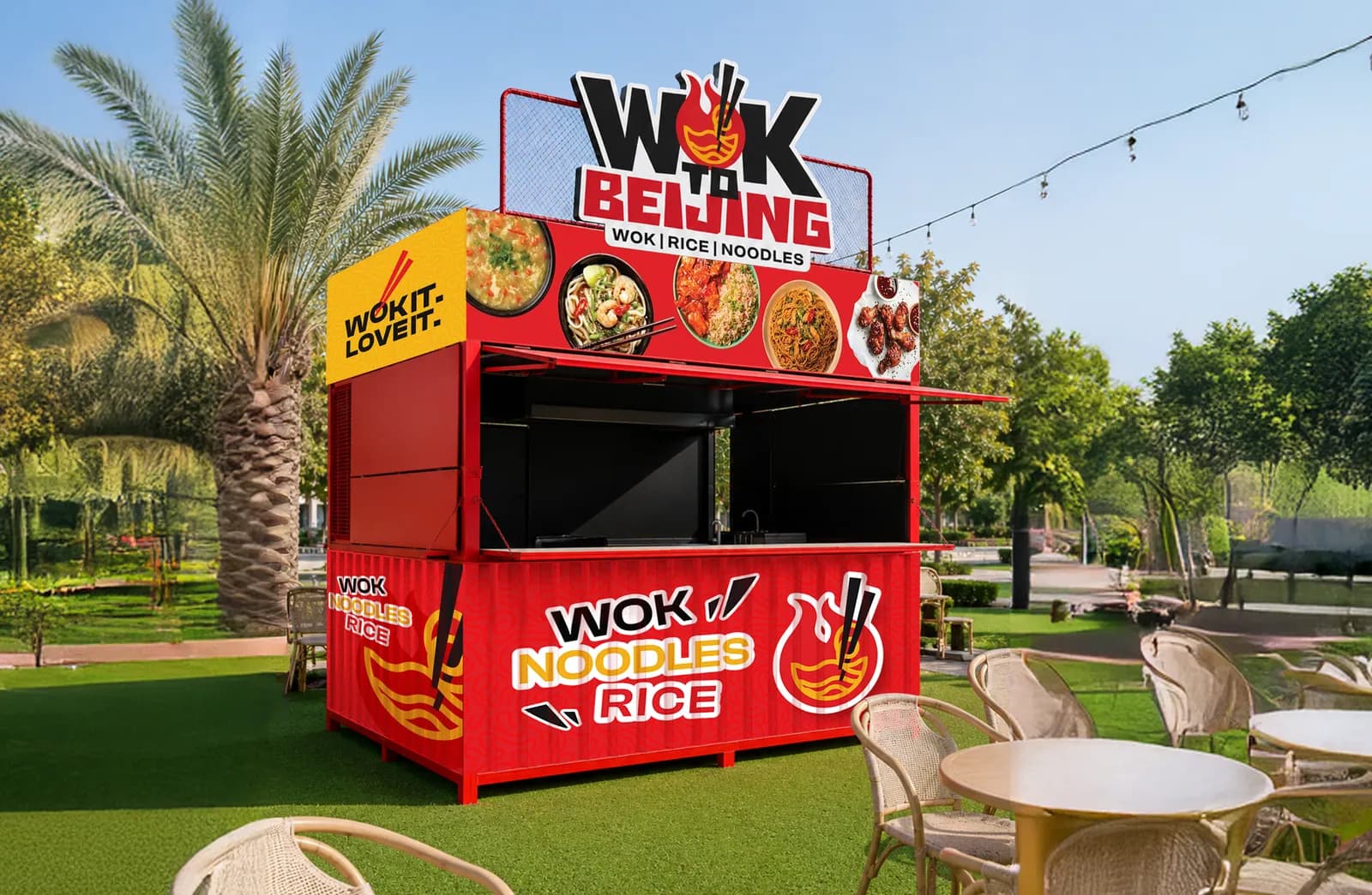
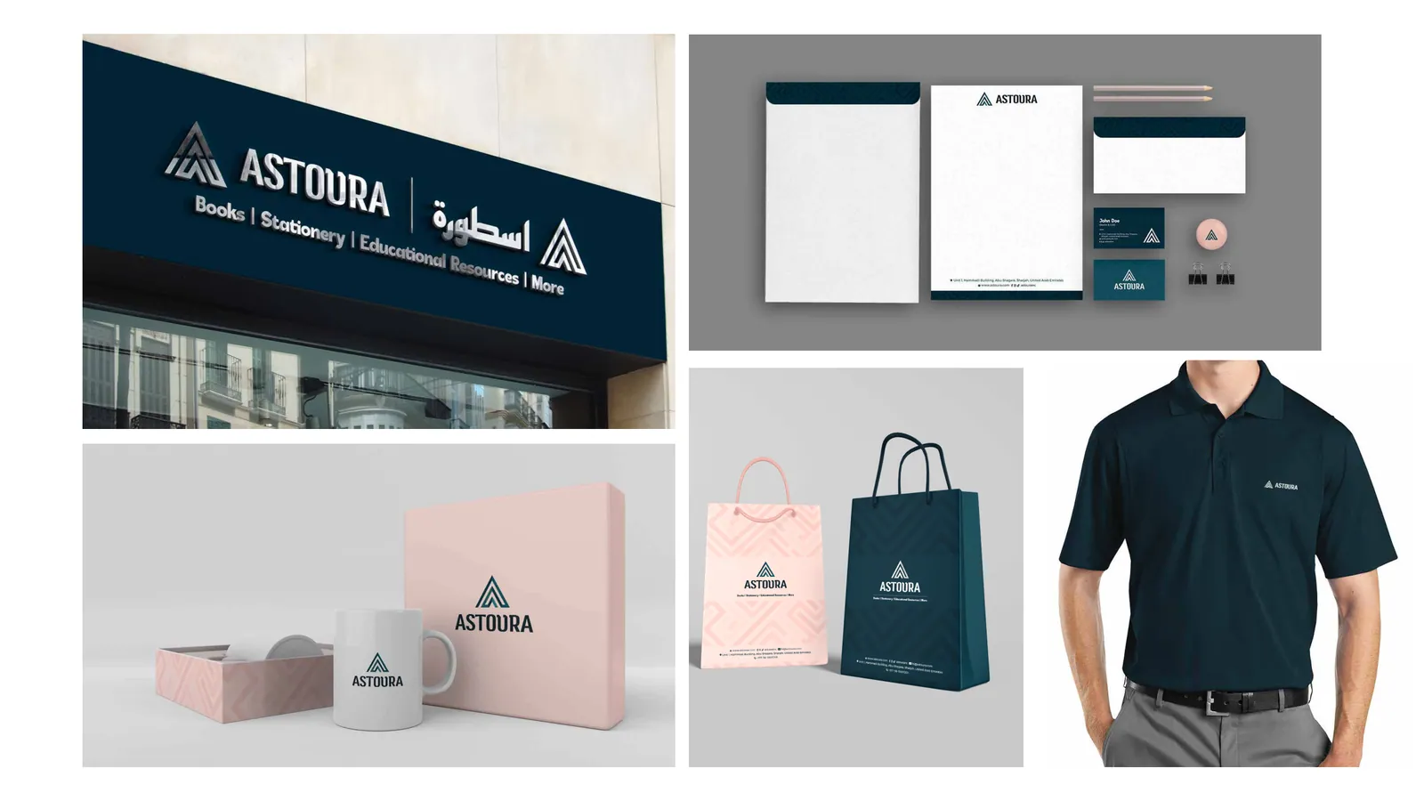
Packaging and signs

The decisions we make you close

This is the actual work, and it is uncomfortable in about the third week, which is the sign it is going correctly.

  1. Who is it for.

    Specifically enough that it excludes somebody. A brand for everyone is a brand with no memorable edge and no reason to be chosen.

  2. Who is it not for.

    The harder half, and the one that saves you money for the next five years, because it tells you which opportunities to turn down.

  3. What you refuse to sell.

    Every brand that means anything has a thing it will not do. If yours does not, it is a shop, which is fine — but it should be priced and marketed as one.

  4. What you are actually competing on.

    Price, speed, quality, trust, access or taste. Pick one to lead with. Two is a position nobody can repeat back to you.

  5. What you sound like when something goes wrong.

    Most voice guidelines describe a brand on its best day. The useful ones cover the apology, the price increase and the delay.

  6. What it looks like at sixteen pixels, in one colour, printed badly.

    A mark that only survives on a white screen at full size is a decoration, not an identity.

  7. What the one sentence is.

    The sentence your own staff use when a stranger asks what the company does. You already have one. It is usually wrong, and fixing it changes more than a logo does.

We bring research to each of these — competitors, audience, where the category is crowded and where it is empty — but research informs the decision. It does not make it, and an agency that hides behind a deck of findings has not done the job.

What you actually receive

A brand should arrive as something other systems can read, not only as a PDF that gets forwarded until somebody picks a colour with an eyedropper.

  • The identity: the mark in every form it needs, the type, the colour, the photographic direction, and the rules for all of it.
  • Colour and type as named tokens, in a file your developers and ours use directly. On our builds, no raw hex anywhere in the code.
  • One icon file: a single sprite your site and your decks pull from.
  • The print exceptions, written down: a second, deeper red for small print where a screen red goes muddy, and which to use where.
  • The words: positioning, the one sentence, the voice rules, names and taglines where naming is in scope, and a messaging frame your team can write from.
  • Every file of the brand, as a download link that stays open until you or we close it.

Where the AI helps, and where it is no use at all

Before the design, we ask the assistants about you. We put your category's buyer questions to ChatGPT, Gemini and Claude and read how you are described; a wrong description is a positioning problem, better found before the logo than after.

After the design, the guide has to survive volume. With the search work, your site publishes roughly an article a day; a brand defined as tokens holds across all of them, and a PDF does not.

And where it is no use. It cannot hear what you actually mean. The decisions above get made by people, in a room.

Rebrands, and how long it takes

If your brand has outgrown its identity, or the market moved underneath it, we run the whole thing: strategy, identity, and the rollout across every place your old one is still sitting.

One rule we keep: when you ask for a restyle, your words stay yours. If we think a line should change, you get it as a question, flagged, with the reason.

How long depends on how much there is to decide, how many places the brand has to reach and how fast approvals come back; a small identity refresh finishes sooner than a full rebrand, and about half this work is rescue rather than invention. A complete brand and website together is a different job: Launch.

Start with the decisions

Tell us the sentence your staff use when somebody asks what the company does. It usually tells us more about what the engagement needs to be than a brief does. You get back a scope, a date and a quote.

Prefer to talk first? Call or WhatsApp us.